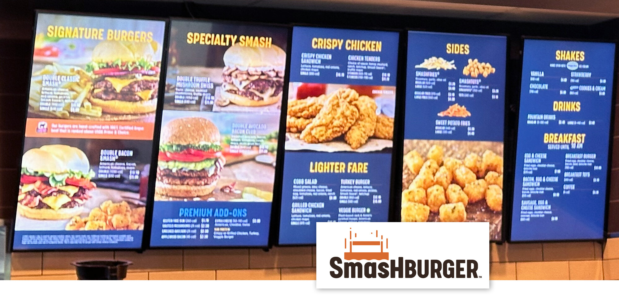
In our series, “Digital Menu Board Makeovers: Insights & Best Practices,” we assess Smashburger’s digital menu boards at Charlotte Douglas International Airport in Charlotte, NC. While the restaurant offers a diverse menu, there are opportunities to enhance the effectiveness of their digital menu displays.
Strengths
- Brand Integration: The menu boards incorporate large, high-quality photographs of primary and specialty burgers, aligning with Smashburger’s brand identity.
- Appetizing Imagery: The use of attractive food photography entices customers and showcases signature items effectively.
- Clear Categorization: The menu is divided into sections such as Signature Burgers, Specialty Smash, Sides, and Drinks, aiding in customer navigation.
Areas for Improvement
- Visual Hierarchy: The prominence of large burger images on the left panels may overshadow other menu items, potentially limiting exposure to the full menu.
- Readability: The dark blue background with yellow and white text can make smaller descriptions challenging to read, especially for customers with visual impairments.
- Typography Consistency: The use of sans-serif fonts is appropriate; however, the white text with drop shadows over photographic content can reduce legibility.
- Physical Setup: The tilting angles of the displays and visible wires detract from a polished appearance.
How SmarterSign Can Help
- Design Optimization: SmarterSign offers expertise in creating balanced visual hierarchies, ensuring all menu items receive appropriate attention.
- Enhanced Readability: Our platform provides tools to adjust color schemes and typography for optimal contrast and legibility, catering to all customers.
- Consistent Typography: We assist in selecting and implementing fonts that maintain brand consistency while enhancing readability across all menu sections.
- Professional Installation Guidance: SmarterSign offers support in achieving uniform display alignment and concealing wiring, resulting in a clean and professional setup.
By addressing these areas, Smashburger can enhance its digital menu boards, leading to improved customer engagement and satisfaction.
For personalized assistance in optimizing your digital menu boards, connect with a SmarterSign expert today.
