Mason’s Lobster Rolls – Digital Menu Boards
Welcome to our exciting article series, “Top 5 Digital Menu Board Designs – And Why We Like Them.” In this series, we delve into the innovative world of digital menu boards, a critical element in modernizing and enhancing the customer experience in restaurants and cafes. As we explore the top five designs that have caught our eye, we will analyze not only their aesthetic appeal but also how they enhance customer engagement, streamline ordering processes, and reflect the unique brand identity of each establishment. Join us as we uncover the art and strategy behind these top designs, and why they stand out above the competition.
The first of the top 5 digital menu board designs we will be reviewing is for Mason’s Lobster Rolls. Mason’s Lobster Rolls is renowned for bringing the authentic taste of Maine’s lobster shacks to a wider audience, Mason’s Lobster Rolls has established itself as a must-visit destination for seafood enthusiasts. At Mason’s, the experience is not just about savoring the rich, succulent lobster nestled in a perfectly toasted bun; it’s also about the ambiance. To support this unique concept in dining, the digital menu boards need to be “on brand”, easy to understand, and focused on creating maximum value for both customer and company.
Brand Consistency
To support the Mason’s Lobster Rolls brand, the digital menu board designs needed to blend the authenticity of a Maine lobster shack with the sophisticated and modern feeling of the dining experience. The digital menu board designs do an excellent job of achieving this in several key ways.
Organic Textures
The designs for these digital menu boards bring together a number of organic textures that help ground the aesthetic to visual queues of a Maine lobster shack. These elements help to create the ambiance that brings visitors deeper into the desired brand experience.

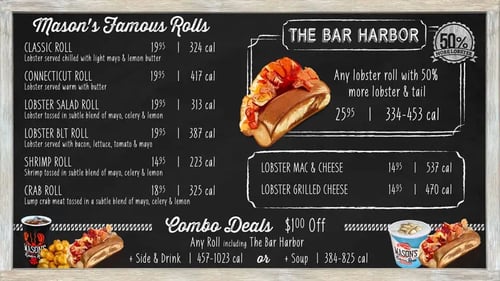
The background of these designs emulate a chalkboard that would be similar to what you may find in a traditional lobster shack. This style helps create a foundation that gives an authentic feeling to the designs. A realistic styled wooden frame surrounds the menu to complement this traditional look even further. The wood frame element also complements some of the other physical decorations that adorn the restaurant.
Thoughtful Typography
The design combines a chalkboard style background with fonts that supports this typographic treatment. The designers in this case have effectively used easy to read typefaces while maintaining the concept that these could have been drawn on a chalkboard. The use of different typefaces to help highlight specific menu items is also extremely effective. A bold script typeface is used to identify major categories and combo deals. Item names and descriptions are in a contrasting sans serif font with both typefaces complementing the chalkboard style. The feature section uses a special typefa ce that draws additional attention to the item and helps this important item stand out.
Chalk Drawings
This is one of our favorite touches on these digital menu designs. Food photography is often used in digital menu boards. In the case of these designs, the use of standard food photography may have looked out of place with the look and feel of the chalkboard. The designers of these menu boards created realistic chalk drawings of the various food items to make sure they fit well with the overall design approach. These kinds of details are difference makers when creating a perfect design.
Easy To Understand
One of the important concepts for menu boards (both traditional and digital menu boards) is that the items are easy to understand and helpful in the ordering process. The digital menu board designs for Mason’s Lobster Rolls are well organized, and presented in a way that keeps things simple for customers. Item names and descriptions are clear and not overly wordy. Many times companies try to put too much marketing language in item descriptions. These menus take the opposite approach which makes it easy for patrons to identify the ingredients in each item.
Focus on Creating Maximum Value for Customer and Company
Balancing your customer’s needs and experience while creating maximum value for the company can be a challenge. In these digital menu boards the designers have threaded this needle to perfection. Presenting clear options for customers while offering easy upsell for the business is a win-win with these designs. Items that should be a point of focus are clearly laid out and are augmented with imagery to bring these sections to life.
One of our favorite sections of these designs is the area on the menu that presents THE BAR HARBOR roll option. This is a roll that gives 50% more lobster & tail for a small up-charge. The section is presented with a special label, a bounding box that looks like a chalk drawing and a big beautiful illustration of a roll topped with a lobster tail. A special indicator pointing out the 50% MORE LOBSTER is a great way to draw attention to this value proposition for customers.

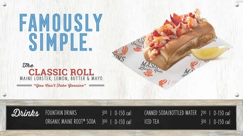
The middle screen of these digital menu board designs combines the chalkboard style section for beverages with a large promotional area for LTOs (Limited Time Offers) and other promotional imagery. Even with these images the designers have incorporated nail heads that look like the promotion is presented in a more physical manner and helps visitors forget that the menus are digital.
