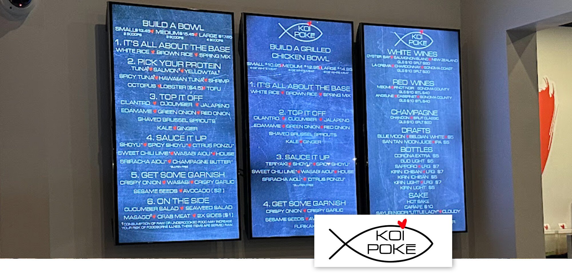
In our series “Digital Menu Board Makeovers: Insights & Best Practices,” we examine Koi Poke’s digital menu board implementation at their DC Ranch location in North Scottsdale, AZ. While the design aligns with the brand’s aesthetic, there are opportunities to further enhance readability and customer experience.
Creative Design
Koi Poke’s digital menu boards feature a color scheme that matches the brand’s aesthetic and complements the restaurant’s decor. However, the use of light text on a dark background, combined with textured backgrounds and all-uppercase lettering, can hinder readability. To improve clarity, consider using dark text on a light background, simplifying the background texture, and reserving uppercase letters for titles or headings.
Organization
The menu boards are strategically placed on the back wall where orders are placed, ensuring visibility. However, the absence of food photography limits the ability to guide customers toward specialties or unique items. Incorporating high-quality images of signature dishes can entice customers and highlight popular offerings.
Physical Setup
The digital screens are well-positioned and integrated into the restaurant’s layout. Ensuring consistent brightness and color calibration across all screens can enhance the overall visual appeal and provide a cohesive customer experience.
Recommendations
To maximize the effectiveness of digital menu boards, consider the following strategies:
- Enhance Readability: Use dark text on a light background and minimize background textures to improve text clarity.
- Incorporate Food Photography: Add high-quality images of popular dishes to attract customer attention and promote specific items.
- Maintain Display Quality: Regularly calibrate screens for consistent brightness and color accuracy.
By implementing these enhancements, Koi Poke can further improve its digital menu boards, leading to increased customer engagement and satisfaction.
For personalized guidance on optimizing your digital menu boards, connect with a SmarterSign expert today.