RESTAURANT NAME
Freshii
LOCATION
Fashion Outlets of Chicago | Rosemont, IL
5.66 |Overall Score
Digital Menu Boards are becoming more and more pervasive for restaurants of all types. As experts in the industry, we break down key details of specific implementations and provide a score based on three primary categories:
6.0 | Creative Design – How well is the overall design executed
6.0 | Organization – How well is the content laid out
5.0 | Physical Setup – How good is the physical presentation
Freshii is a health-focused fast casual restaurant chain that serves up fresh, nutritious meals made with high-quality ingredients. Their menu features salads, wraps, bowls, burritos, and smoothies that cater to a variety of dietary preferences, from vegan to gluten-free. With a mission to help people live better by making healthy food convenient and affordable, Freshii has become a popular choice for health-conscious diners on the go. The digital menu boards reviewed here are in the Fashion Outlets of Chicago in Rosemont, IL.
Creative Design (Score: 6/10)
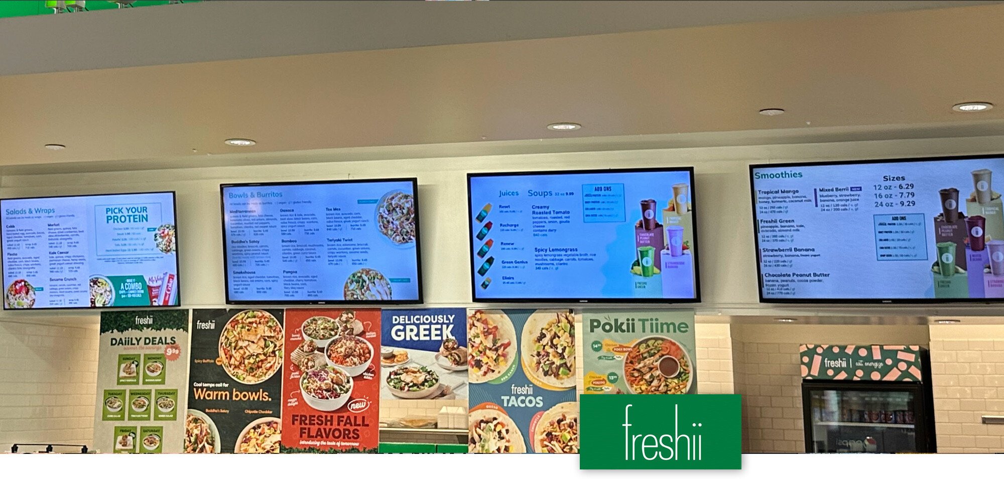
Branding – The digital menu boards for Freshii span the width of the back wall of this establishment. Directly above the menu boards is a vibrant green soffit with nice branding. This branding makes it unnecessary to incorporate branding into the design. Directly below the digital menu boards are bright printed posters with specials and LTOs (Limited Time Offers). The menu boards in this particular implementation get overshadowed by the other visual elements and a strong brand aesthetic is not created. The elements on the digital menu board are clean but the competition with the other visual elements is too much to have the menu boards stand out.
Visual Appeal – As mentioned above, the other visual elements in the restaurant create a challenge for the menu boards. The visuals inside the digital menu boards are not as large or vibrant as the other elements in the space. This imbalance makes the digital menu boards far less appealing and likely far less effective. The food photography uses is quite nice (better than most) but still competing for attention with the large vibrant images of the printed posters. The branded cups with Juices, Soups and Smoothies all blend into each other a little too much and are hard to differentiate to create an impression on the consumer.
Typography – The typography is clean and supports the brand. The easy to read typefaces help but the density and small size of some of the content takes away from the readability and usefulness. I am sure that most guests find it hard to read the small print. Better use of the available space, and some thoughtful editing of the content would be a valuable change for these menus.
Organization (Score: 6/10)
Information Layout – The menu is split into logical categories like Salads & Wraps, Bowls, Burritos etc. However, the layout lacks clear hierarchy and structure. Multiple competing “boxes” of information make scanning and comprehension difficult, especially from a distance. Text size is small in places, hurting readability. The overall organization does not effectively guide the customer’s eye or decision making process. The individual menus are nicely organized for the most part (other than putting Soups and Juices on the same menu with Smoothies on the next menu over). This seems a little out of order. It would probably be a more logical flow to have Juices and Smoothies next to each other and Soups more connected to the food items.
Clarity – Overall readability is the biggest issue with the clarity in these menus. The text is too small in many cases and the use of the available space could be improved. There is a good deal of negative (unused) space on the two right menus while the two left menus are cramped and hard to read.
Physical Setup (Score 5/10)
Displays – The digital screens appear to be two different brands or models with the left screen being different from the other three. The brightness of the left screen is higher than the other three. This is likely a replacement screen or an add-on screen and an exact duplicate of the other screens was not available. The screens do no appear to be commercial displays which may impact the longevity of the screens and may be why they had to replace one.
The biggest problem with the physical setup is the use of the space below the menus with the assortment of posters that seem to have no rhyme or reason. Visually these are very distracting and are likely not enhancing the ability for customers to make easy decisions.
This individual components of this implementation are not bad, but when put all together create a disjointed experience that leaves a significant amount of opportunity for improvement..
Want to have your digital menu boards reviewed by our experts or find out how digital menu boards can help your business?