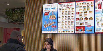
Digital Menu Boards
Easily update menus in real-time, highlight promotions and engage guest with visually dynamic menu displays
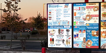
Digital Drive-Thru Signage
Boost drive-thru efficiency with customized, automated outdoor menu displays.
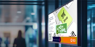
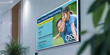
Corporate Communication
Communicate with employees, customers, and visitors to make an impact.

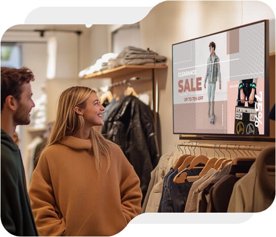
Retail Digital Signage
Transform spaces by delivering promotions and branding across retail, hospitality, and business.
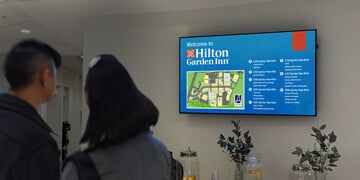
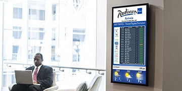
Hotel Digital Signage
Keep your guests informed about your services, events, and more with real-time digital signage.
Hospitals and Healthcare
Engage your patients, visitors and staffs with clear and up-to-date details of your most important information.
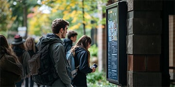
Education Digital Signage
Communication on campus is key. Keep students, staff, and visitors in the loop.
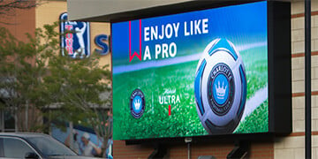
Digital Out-of-Home (DOOH)
Utilize displays across public spaces to connect with people outside their home.
Flight Information Displays
Display real-time flight, train, or bus information ideal for airports, hotels, and transportation hubs.